Every day consumers are bombarded with ads. When consumers recognize your ad even before seeing the logo, your company has a notable brand. There are many ways to have a recognizable, well-known brand, which we will discuss in this post.
Successful corporations start by having brand guidelines. This is a necessity. Brand guidelines dictate what logos, colors, fonts, and imagery should be used (or not used) when presenting the brand. This leads to having a uniform image so the user knows and recognizes your company’s logo.
Getting Started
For instance, when you see a woman walking down the street in a bright golden yellow top and a cherry red skirt, it’s hard not to associate those colors with the golden arches brand, McDonald’s. That’s actually free marketing! It’s like a game of memory, the consumer uses color association and links it to a brand and you want that to be your company’s image. To apply this method, let’s say your company’s color is blue. Be bold about it –use it in color scheming emails, website pages, advertisements, etc. Be discovered, be heard, be known by sticking to your company’s brand guidelines, be bold about it and stick to the strategy established.
Fundamental Example
Another widely known example is Apple’s iconic advertising. All of Apple’s billboards, commercials, digital and print advertisements use the same straightforward formula: black or white background, sanserif font, and the main focal point - the technology. Apple has used this strategy for a long time, making it transparent when other companies use the formula for their ads. On one hand the companies using Apple’s formula are smart because they know it works, but on the hand the consumer thinks Apple because they associate that the branding. Consumers these days value uniqueness, they respect authenticity.

Pro Tip: Know Your Scroll
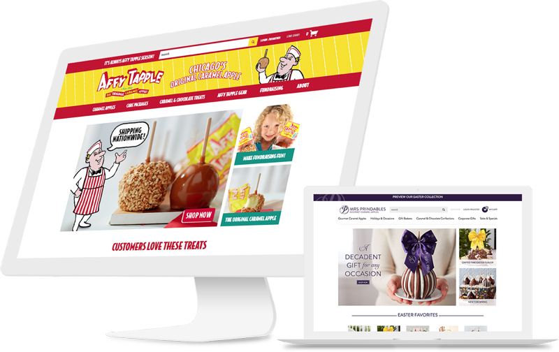
Many of the sites developed by Americaneagle.com showcase bold, uniform branding. For instance, Affy Tapple’s website displays a bright, playful design similar to their famed candy apple packaging. A pro tip from this site: when a user scrolls toward the bottom of the homepage - at every point it’s evident through imagery, colors and fonts that they are still on the same site. This is important given the multitasking, distracting, and short attention span of most consumers. Consider scrolling to the middle of your website - if you pretended you were a first-time site visitor, would you know you were still on the same website? Top to bottom, your site should tell your story.
Thanks for reading – check back soon for Part 2 and more top branding tips!
Contact Us Today!