In a previous article I discussed the concept of responsive content. Now, I couldn’t talk about responsive content without bringing up the topic of emails. One of the biggest reasons smartphones took off early on with Windows Mobile and Blackberry was due to the demand of needing access to emails while on-the-go. Today, for many, it is hard to imagine not having access to email wherever you may be. What started as a need for business individuals has turned into a need for all in our never ending quest to always be connected and available.
With that said, mobile email viewing is up over 48% compared to desktop. Additionally, it is said that the likelihood of an email being re-opened on another device is around 2%. This means that email users are viewing on their mobile devices more each day and are highly unlikely to view it on a desktop device after that initial view.
Let’s break it down a bit
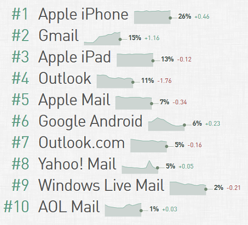
While there are a range of email clients available there are a few that really stand out. It is highly likely that if you use email at work you are using Microsoft Outlook. Outlook is easily the most widely utilized desktop email client. Moving beyond that there would be Gmail on both the web and on Mobile devices. Additionally, the native email client on Apple’s iOS devices such as the iPhone would be highly popular. Below you can see a breakdown of the top 10 email clients broken down from August 2014:

As you can see, the first half is comprised of the big 3 I mentioned. I will note that there isn’t a clear indication regarding Gmail Web and Gmail App, but we can assume it is the combined amount. Additionally, it would stand to reason that majority of Android users would tend to use the Gmail app with their Gmail account.
What does it all mean?
The take away from this data is that you need to start thinking of making sure your emails are easily viewable on small-screen devices such as phones. Gone are the times where you can safely assume that email is being viewed in a web browser or desktop client on a large screen. The reality now, just like with websites, is that your email will more than likely be viewed on a wide range of devices with varying screen sizes. For websites the answer became pretty clear in many cases; building a site responsively would help account for the range screen sizes being viewed on. Logically, you would think the same can be applied to email, after all they both are written in HTML and Text.
Responsive Emails to the rescue! Or not…
Unfortunately, the world of emails is not the same as that of web browsers and websites. If you thought there are a lot of browsers and browser compatibility issues with websites, email clients are an entirely different game. There are a vast amount of email clients, but for our purpose lets only focus on those top level options. To jump a bit into the technical side of things, you may remember from an earlier blog post where I described what makes up a traditional responsive site. The key ingredient to support a range of screen sizes is the ability to utilize media-queries in order to adjust how things visually display for different screen widths.
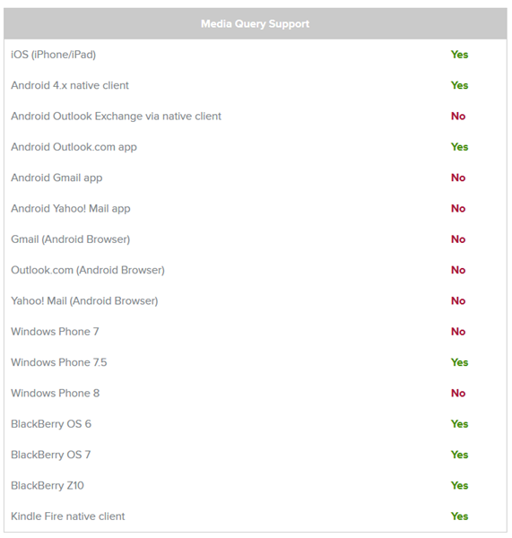
That is where things get a bit complicated. You see, today not all email clients support media-queries. I am not even referring to older or unpopular email clients, I am talking about some of the same highly popular clients that most use on a daily basis. For example, the Outlook desktop application does not support media-queries and somewhat surprisingly the Gmail App on all devices does not support it either. It is hard to imagine that 2 of the most popular email clients do not support such a feature.

This means that while you could still attempt to do a "Responsive Email", which has become a rather popular buzz word lately, you would need to be mindful that 2 of the most popular email clients will not be able to utilize the responsive views.
There must be a better option right?
So is there another option we can use to cover everything? The real answer is that there is never a single correct answer, but rather there are different methods to reach the best outcome based on needs and requirements. Like many things, it is often best to think simple and to not over complicate things. Many methods out there that make use of responsive techniques tend to take a large-screen email and build it to adjust into a mobile-friendly email using media-queries. As I said previously, that would mean that a user viewing in the Gmail App would then see the large desktop view instead since their email client lacks the required support.
So just like it is better for websites, it is a good idea to take a mobile-up approach and focus on a user-first method. You may not even need to utilize any of the responsive media-queries to have a flexible user experience for a range of screen-sizes. An email by default should always be a "fluid" design so that it can be flexible to shrink in width for a phone or expand on a desktop. Many emails can be handled this way, simply put, in a single column vertical stack of content. A simple example is when you compose your own email using text and images. That would be fluid since the text would fill the screen and wrap to a new line as needed. This does not need to be limited to plain text, here is an example of a nicely design fluid email.
From a fluid-design starting point you are able to use media-queries to enhance the view on larger/smaller devices as well. I would note, that these should be considered optional enhancement and should not be required by the design. This is again because not all email clients will be able to view these enhancements.
As you can see, there are a few different ways of accounting for the various devices and screen size. A good starting point is often finding out what your user base is actually using by using various analytic techniques. Additionally, Americaneagle.com would be able to discuss your needs and requirements and find a suitable solution for you.
Information and stats are partially sourced from litmus, Campaign Monitor and Style Campaign.