"Too much of a good thing is bad," is a phrase I am sure many of you have heard at least once in your life. While the phrase may be a bit cliché, there is some truth to it. It is something that I have seen on many sites in my time. You visit an ecommerce site only to be overwhelmed by a multitude of site marketing and hundreds or thousands of hierarchical navigation links. You may have an idea of what you want, but have no idea how to get to it. What may start as good ideas and intentions snowball into what ends up negatively impacting the ultimate goal.
"What is the ultimate goal?" you may ask. The ultimate goal should be a great user experience.
User Experience
Now, you may have other goals in mind for your site besides a great user experience. You may want increased sales, increased user traffic, more ad revenue, etc. Whichever additional goals you may have for your site, it must be realized that they all tend to route back to user experience. A bad user experience will lead to more users dropping off during checkout or leaving the site after only a short time. If a user enjoys visiting and using your site, they are typically going to turn into conversions.
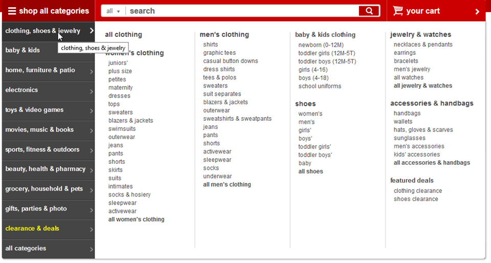
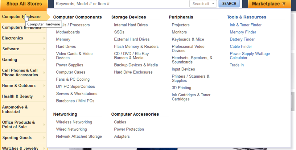
Referring to my earlier description about overwhelming navigation, let’s take a look at sites like Newegg.com and Target.com.

Target.com combines multiple departments within a single mega menu flyout

Newegg.com combines multiple sub categories within a root category
While it is understood that using these listing can help pinpoint down to what you are looking for, it does take time to scan through all the information being displayed on the screen at once. While I can say I have made use of the navigation shown on newegg.com, I will say that it always feels slow and clunky on any site where this is in use. What should be noted is that neither Target.com nor Newegg.com can be faulted for having this robust navigational structure. They offer a wealth of various items, and that results in many departments and categories.
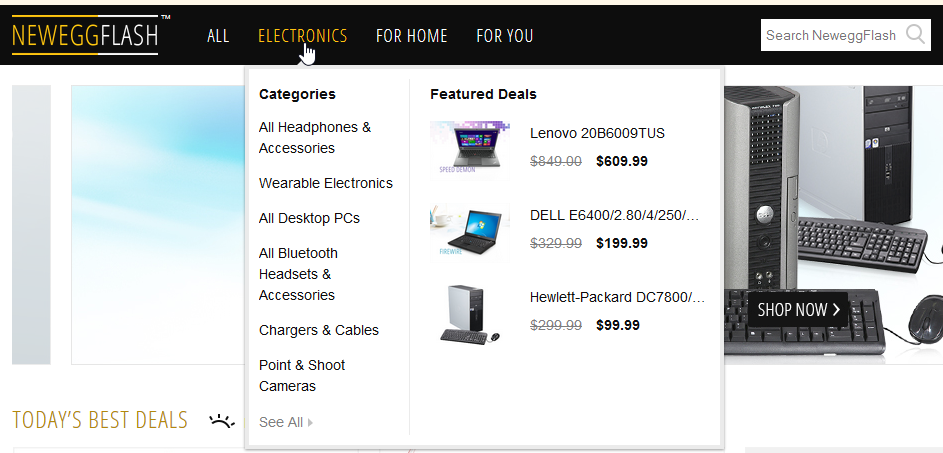
Interestingly, newegg.com has another site that is worth taking a look at. They have a newer division that specializes in "flash sales", short availability, and daily deals. True to the nature of the "flash sale", flash.newegg.com has decidedly different visual appeal compared to their parent site.

flash.newegg.com offers a simplified navigation structure
Since the site focuses on daily deals, more emphasis is made on the landing page and top level categories than digging deeper into sub levels. I feel that the parent site could learn a lot from this site as many users are more than likely using a set of key categories rather than digging deeper. I will be curious to see if some of the design elements make their way in time.
It is worth mentioning that target.com and newegg.com both offset the complexity of their navigation by focusing on a very large (roughly 75% of the site width) search bar. This is what allows those users that know what they want, or roughly what they want, to get to it as fast as possible. They have the search front and center and easily accessible.
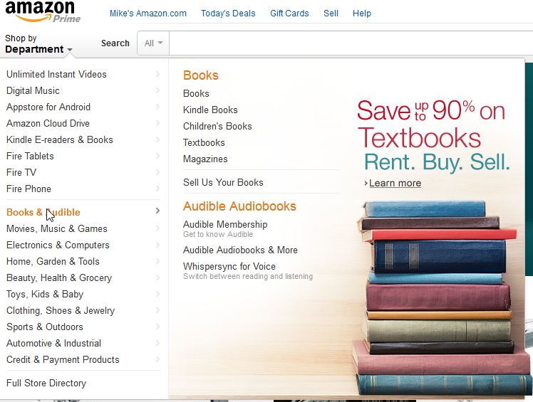
Let’s take a look at another highly popular site, Amazon.com.

Amazon uses a condensed hierarchal menu that is limited only to key sub categories
Amazon’s menu is similar to what we saw on Newegg’s flash sale website where it is far more simplified than showing a multitude of sub categories. Where it differs is with a more robust top level that is all under a single "Shop by Department" button. I am sure Amazon has enough analytics to warrant the use of this menu (I have seen their published studies on this menu) but I have never used it myself. There is a very good reason I have never used it - their search. Anything I am looking for on Amazon is within grasp by using their search, which does also department sub filtering.
If it hasn’t been obvious yet, search is crucial for a great user experience on ecommerce sites, with the only exception being boutique sites that only have a few products in their catalog.
Having a lot of products on your site is fine – just make sure your users can find what they’re looking for quickly and easily!