The A/B testing team here at Americaneagle.com has designed set-up and implemented hundreds of split tests over the years, but one of our favorite types of tests focuses on removing distractions and increasing page clarity.
We can easily fall into the trap of wanting to place more ‘things’ on a page, thinking that these elements will somehow better persuade the visitor to take the action we want them to take. Sometimes it works, and sometimes it doesn’t. The only way to find out is to test it! If you are new to the concept of A/B Testing, check out our introductory article here.
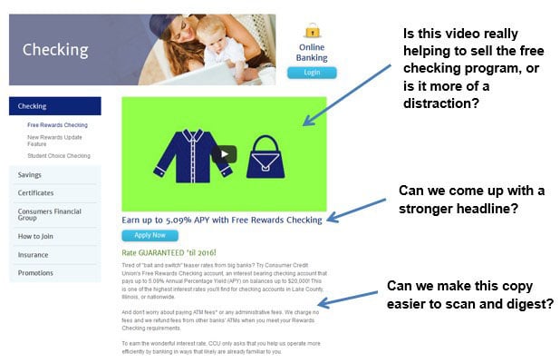
In this post, I’ll talk about a very simple test we created for a credit union to help remove what we thought was a distraction on the page. First, let’s take a look the original page. The page advertises the credit union’s free checking program, and as you can see, it starts with a video to entice and motivate the user to eventually click on the “Apply Now” button. All in all, this is a pretty good page, but we felt we could make some pretty quick improvements.
Here is how the original page looked along with our initial thoughts for improvement
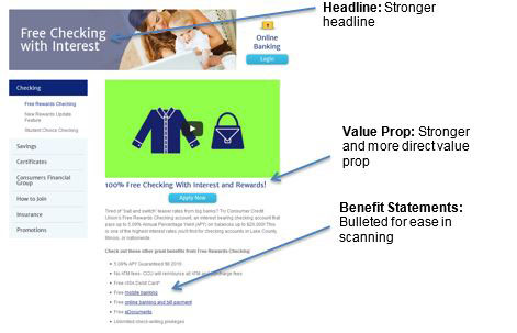
Based on our initial questioning, we decided to create two different page variations to see how they performed against the original page.
Variation #1:

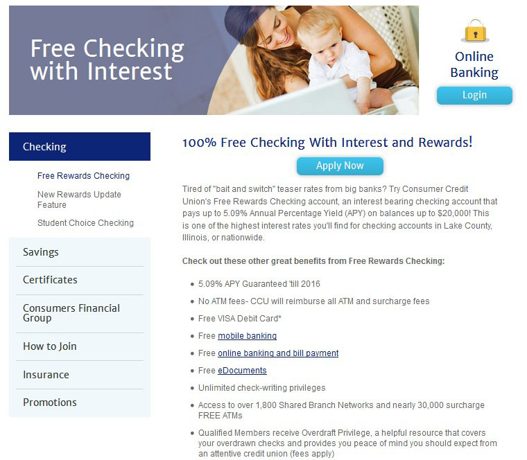
Variation #2
Variation 2 is the same as variation 1, but with the video completely removed from the page.

Testing Our Two Variations Against the Original
Our goal for this test was to measure click-engagement on the blue “Apply Now” button. We set up the test so that 1/3 of the page traffic went to the original, 1/3 to variation #1 and the remaining 1/3 to variation #2.
Here were the results of the test:

The conversion rate numbers in the above table represent the conversion rate (click engagement) of the blue “Apply Now” button. Variation #2, the one without the video, showed a 141% improvement in “Apply Now” clicks over the original page. Over the course of 12 months, variation #2 will produce over 3,000 additional button clicks over the original.
Takeaways
As you can see, this was not a complicated test and, quite surprisingly, button clicks went up when we removed the video entirely from the page. We like to assume that videos always work better in converting prospects, but the power of this test is that it proves we can’t make assumptions – we have to test everything. Testing provides a systematic way to continuously evolve and improve your website.
This test also shows how simple test ideas and changes can result in very large performance improvements. If you’d like to see what A/B testing can do for your site, contact us for a free no-obligation test set up. Our testing team will come up with a testing hypothesis, set up the test and discuss the final results.CLICK HERE to get started.
