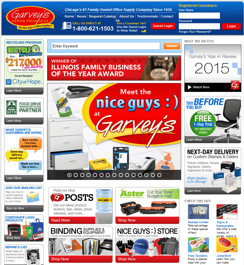
Have you ever heard the term “Banner Blindness?” It was coined a dozen years ago by researchers Jan Panero Benway and David Lane at Rice University. It refers to the phenomenon where a web page contains so many banners that visitors either consciously or subconsciously start ignoring them. Here’s a good example of it.

While Banner Blindness can happen on any page of a website, it most often happens on homepages.
Why?
Because homepages are notoriously political and everyone from the sales manager to the marketing manager to Ed over in accounting all have an idea of what should be on it. When everyone’s opinion is validated, you get a homepage that looks very similar to our above example. A page with such a high cognitive load that most visitors can’t even begin to digest the information.
I’m involved in hundreds of split tests we run every year for our clients, and some of the most powerful test results occur when we remove information from the page in order to reduce cognitive load and Banner Blindness.
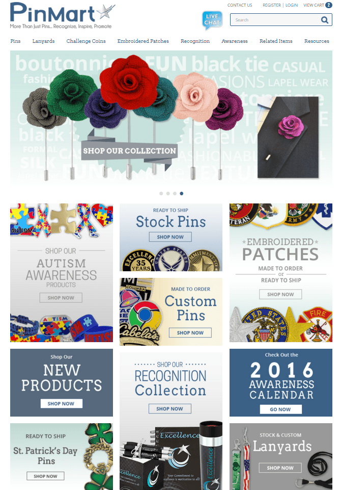
Let’s take a look at an example. Below is the homepage for Pinmart. Pinmart sells all different types of lapel pins. As you can see, their homepage contains quite a few banners. It’s difficult to even digest the messaging on these banners. Most visitors would probably take the easy route of just clicking into the main navigation or using the internal site search, if they don’t leave first!

We decided to split test this page in order to see what effect a reduction in banners would have on overall click-engagement. We decided to limit the number of banners underneath the main sliding banner to just 6 instead of the current 9.
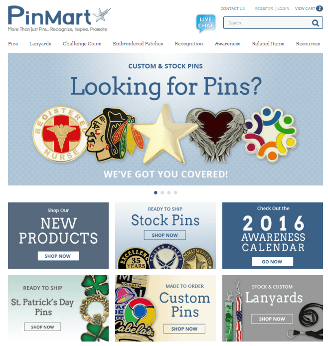
Below is the test variation we came up with.

By cutting the banners down from 9 to 6, we immediately see how much easier it is to scan the page and digest the information. This has the effect of immediately lowering the cognitive load and minimizing Banner Blindness. The question is, does this actually improve overall banner click engagement? This was exactly what we wanted to find out through our test.
We split the traffic coming in to the homepage so that 50% saw the original and the other 50% saw our test variation. We then measured total banner clicks between the original and the variation. Our test variation was the clear winner, providing a 10% increase on aggregate banner clicks despite the fact that 3 banners were removed. In addition, overall transactions went up 1.9%.
Conclusion: Banner Blindness is a very real phenomenon. It works to reduce clarity and increase both distraction & user anxiety – all factors that could lead to a reduction of form completions and online sales.
Take a look at your homepage today and see if you can think of ways to simplify and clarify your message. Once you have an idea, give us a call. We’ll help you take that idea and split test it against the original page. You just might be surprised at the results!
